Links vs. Buttons
A button is a link is a button... Why having to different tags if they are easily interchangable with each other?
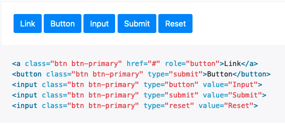
The popular bootstrap toolkit knows exactly what I'm talking about and just makes it all look the same:
So what's the point of differentiating here?
It's about expecations and accessibilty.
The button-tag and link-tag were made with different ideas in mind.
A link will redirect the user to a new page or another section within the same page. It's triggered by the enter key.
A button will trigger some kind of action: Open or close a layer, sending a form, etc. It's triggered by the space bar.
Why is that important?
A user who's using their keyboard to navigate through your page will be confused when trying to open what appears to be a link with the enter key - and nothing happens. Vice versa trying to open a button with the space bar is just as annoying. Why frustrating users?
Conclusion
There is a tag for both use cases. Let's apply them accordingly. And then make a link look like a link and a button look like a button.
Don't be like bootstrap :)
